SaaS comparison pages (“X vs Y”) that convert without trashing competitors
Buyers comparing two tools are one decision away from a purchase. A good comparison page helps them make it, and makes you the obvious choice for the right customer.
 Trickency Team
October 20, 2026
4 min read
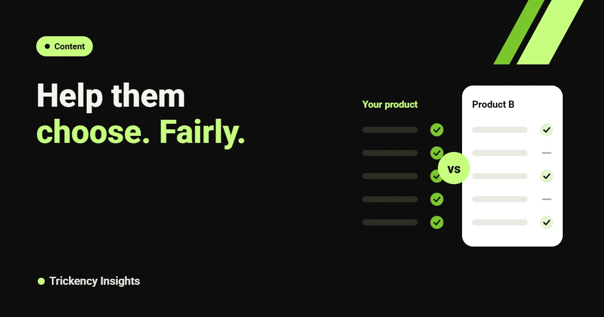
A buyer searching “[Product A] vs [Product B]” has narrowed the market to two options. They want help making the final call. The page that helps them decide, honestly and quickly, usually wins the click, the AI citation and often the deal.
Most SaaS comparison pages fail because they are written for the vendor, not the buyer. Every row says “Yes” for us and “Limited” for them, the tone is defensive, and the reader leaves to find a neutral review. Here is how to build comparison pages that do the opposite.
Key takeaways
- Lead with a short, fair verdict that names who each product suits.
- Compare on the criteria buyers use, not the features you are proudest of.
- Date your facts and admit where the other product is stronger.
- Comparison pages feed both Google rankings and AI assistant answers.
Which comparisons to build
There are three types, in order of priority:
- You vs a direct competitor (“Cloudsquare vs LendSaaS”). Highest intent.
- You vs the old way (“Cloudsquare vs spreadsheets”). Catches buyers who have never bought software in your category.
- Competitor vs competitor (“LendSaaS vs OrgMeter”). Lower intent for you, but a fair page here builds trust and can mention you as a third option.
Pair them with alternative pages, which target buyers who have already decided to leave a product.
The structure
1. A verdict in two sentences
Start with the answer. “Choose Product A if you need X and have a small team. Choose Product B if Y matters more and you have an admin to run it.” This is the sentence Google and ChatGPT will quote, so make it precise.
2. Who each product is best for
Give each product a short “best for” profile: team size, use case, budget, tech stack. Buyers self-select fast, and the wrong-fit ones leave before they waste your sales team’s time.
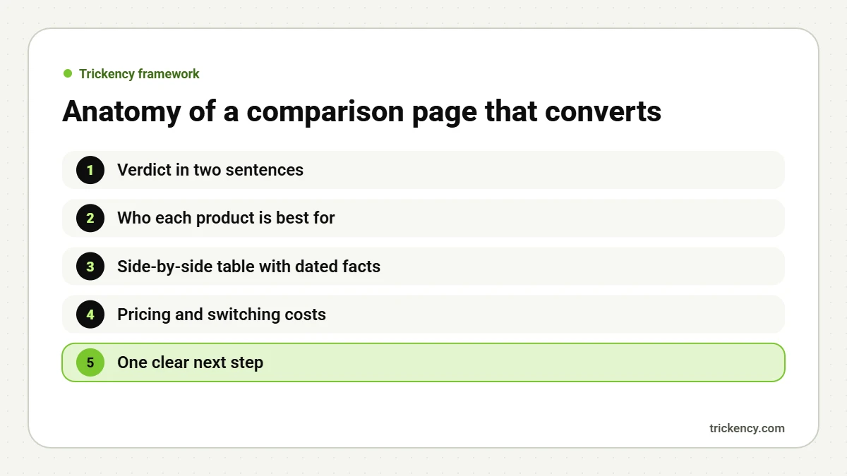
3. A side-by-side table
Choose 8 to 12 rows that reflect real buying criteria: setup time, core workflows, integrations, reporting, security and compliance, support, contract terms, pricing model. Use plain words, not ticks alone. Add a “last checked” date under the table.
4. Pricing and switching costs
Buyers always ask what it will cost to switch. Cover pricing models, migration effort, data export and contract terms. If your product needs onboarding, say how long it takes.
5. One clear next step
End with a single call to action that fits the moment: “See a 15-minute demo of the workflow above” works better than a generic “Contact sales”. Our guide to pricing page copy goes deeper on next steps.
Tone: confident, not combative
Never call a competitor bad, slow or outdated. Describe what they are built for and where your approach differs. When they are genuinely better at something, say so. Paradoxically, this makes your strengths more believable. Technical buyers in particular distrust marketing that only praises itself.
Make it findable
- Title pattern: “[A] vs [B]: Which Is Better for [audience] in 2026?”
- One URL per pair, for example /compare/a-vs-b/.
- Link from your pricing page, product pages and a footer “Compare” menu.
- Add FAQ schema to the questions at the end.
Example: a comparison table that buyers trust
Here is how we would structure the table for a loan-servicing comparison, in plain words rather than ticks:
- Best for: “Funders with syndication and ISO partners” vs “Small funders who need basic tracking”.
- Setup time: “2 to 4 weeks with data migration” vs “Same day, manual import”.
- Collections: “ACH scheduling and failed-payment workflows built in” vs “Tracked manually or with add-ons”.
- Reporting: “Investor and ISO reports out of the box” vs “Standard exports”.
- Pricing model: “Custom quote by portfolio size” vs “Per-user monthly plan”.
Notice what this does. A small funder can read it and correctly decide the other product suits them. That is a good outcome: they were never going to be a great customer. The funders who fit see their exact problems described and book a demo.
Keep pages accurate over time
Comparison pages go stale fast. Set a quarterly reminder to re-check each competitor’s pricing page, release notes and review profile, update the table, and change the “last checked” date. Updated pages also tend to hold rankings better, and an accurate page is your best protection if a competitor ever questions a claim.
Measuring success
Track three numbers per page: ranking for “[A] vs [B]”, whether AI assistants mention you when asked the same question, and demo requests that start on the page. Expect a smaller audience than your blog and a much higher conversion rate. We cover the reporting setup in how to measure SEO by pipeline.
FAQ
How many comparison pages should we start with?
Start with the three to five competitors your sales team meets most often. Expand once those pages rank and convert.
Should comparison pages be gated?
No. They need to be crawlable and readable without a form, or they cannot rank or be cited.
Who should write them?
Someone close to sales calls. The best details come from real objections, not feature sheets.
Want comparison pages that sell? Our copywriting and SEO teams build them for B2B SaaS. Get a free audit to see which comparisons your buyers are searching for.

The Trickency team writes about SEO, AI search and LinkedIn for B2B SaaS and tech companies, drawing on real client work since 2021.